Motivation
This blog post seeks to entertain the reader with a statistical analysis of the flags of countries from around the world. Similarities and differences are uncovered and quantified.
Miscellaneous
The notebook presented here only contains those segments of the code employed which have been deemed insightful of necessary to understand the logic of the analysis. The raw notebook with the army of scripts employed can be found here.
Data
The images of the flags have been obtained from the respective wikipedia pages. They were originally in svg format from which they were converted to png. They are loaded from the disk and stored in a dictionary keyed by the country names:
path_to_image_folder = "/home/bhornung/Documents/flags/data/clean-data/images/png/"
files = os.listdir(path_to_image_folder)
path_to_images = [os.path.join(path_to_image_folder, x) for x in files]
images = (
    (x.split("/")[-1].split(".")[0], imageio.imread(x))
    for x in path_to_images
)
flags = {k: {"canvas": v} for k, v in images}
Preliminaries
Notation
Let the set of all colours denoted by $\mathcal{C}$: \(\emptyset \neq \mathcal{C} \subset \mathbb{R}^{3} \, .\)
A flag, $F$ is an ordered tuple of colours, or, if you will, a two-dimensional sequence of pixels:
\[F \in \mathcal{C}^{N\times M} \, .\]The flags are indexed by i. The i-th flag has a height of $n_{h,i}$ and width of $n_{w,i}$:
\[F_{i} \in \mathcal{C}^{n_{h,i} \times n_{w,i}} \, .\]$c_{ij}$ is the j-th colour in the i-th flag. The number of colours in $F_{i}$ is denoted by $n_{i}$ The entirety of colours in a flag constitute a set: \(\mathcal{C}_{i} = \bigcup \limits_{j=1}^{n_{i}} c_{i, j} \, .\)
Analysis
The colourful aspects of flags are quantified in the following sections.
Colour encoding
For the ease of manipulation, every colour is encoded by a string.
Flags
There are $N_{f}=196$ flags in total. They differ in size and shape. However, all of them will be treated as though they had unit area.
Colour histograms
A selection of image properties are generated, such as the area based histogram of the colours, $\mathbf{w}_{i}$. The histograms contain the areas of distinct colours divided by the area of the entire flag:
\[\begin{eqnarray} \mathbf{w}_{i} &=& \in \mathbb{R}^{n_{i}} \\ w_{ij} &=& \sum\limits_{k=1}^{n_{h,i}}\sum\limits_{l=1}^{n_{w,i}} \frac{\delta_{c_{ij}, p_{kl}}}{n_{h,i}, n_{w,i}} \, ,\quad j \in \left[1, ..., n_{i} \right] \end{eqnarray}\]These probability fingerprints are then loaded in a dataframe.
histo = {k: dict(zip(("colours", "fractions"), create_image_histo(v["canvas"])))
         for k, v in flags.items()}
df_flag = pd.DataFrame.from_dict(histo, orient="index")
Colour spaces and distances
The colours are given in RGB colour model. The RGB colour distances are rather different to how humans perceive dissimilarities between colours. The L*a*b* coordinates are thus calculated between which the $L_{2}$ distances better approximate the human perception.
df_flag["colours-rgb"] = df_flag["colours"].apply(
    lambda x: np.array([decode_colour_code(y) for y in x])
)

df_flag["colours-lab"] = df_flag["colours-rgb"].apply(
    lambda x: rgb2lab(x.reshape(-1, 1, 3) / 255).reshape(-1, 3))
Number of colours
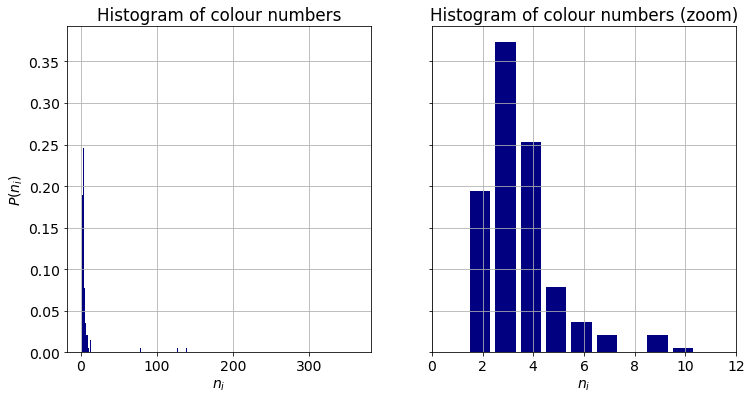
A simple descriptor of complexity is the number of colours in a flag, $n_{i}$. Most of the flags are composed of a handful of colours, less than or equal to ten. There are a few outliers with ten or more, even hundreds of tints. They will dicussed in due course. About eighty percent of the flags have at most four colours. The combination of three components is the most frequent. The average number of colours in a flag is $3.87\approx 4$.
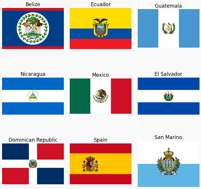
A closer look at the outliers reveals that the high number of colours are due to areas in which hues are continuously changing, such as in the case of Belize. Alternatively, an intricate crest position on the canvas can increase the number of colours substantially as the one does in the flag of Spain. It is worth noting, that seven of the countries are located in Central America. We will touch upon this observation when dicussing the similarities between flags.
Treatment of outliers
In order to make the following analysis and illustrations more coherent, the histograms of the nine flags are truncated and renormalised at the first ten largest contributing colours. The discarded ones have negligible weights.
df_flag.loc[sel, "colours"] = df_flag.loc[sel, "colours"].apply(lambda x: x[:10])
df_flag.loc[sel, "colours-rgb"] = df_flag.loc[sel, "colours-rgb"].apply(lambda x: x[:10])
df_flag.loc[sel, "colours-lab"] = df_flag.loc[sel, "colours-lab"].apply(lambda x: x[:10])
df_flag.loc[sel, "fractions"] = df_flag.loc[sel, "fractions"].apply(lambda x: np.array(x[:10]))
df_flag.loc[sel, "fractions"] = df_flag.loc[sel, "fractions"].apply(lambda x: x / x.sum())
df_flag.loc[sel, "n-colour"] = 10
Colour distribution in individual flags
The number of colours is a limited descriptor. It does not carry any information about the ratio of the constituent colours of a flag. It might as well be that one flag is divided equally between three colours. An other one only have one–one percent contributions of the second and third colours. These cases remain indistinghuished by the above metric. The distribution of colours in a flag can be quantified by several indices. We choose the efficiency or normalised entropy.
\[\eta_{i} = - \frac{\sum\limits_{j}^{n_{i}} w_{ij} \log(w_{ij}) }{\log(n_{i})}\]Efficiency has a clear meaning: unit refers to equally distributed colours. The limit of zero means that a single colour covers almost the entire canvas. It also owns the favourable property of having the same lower an upper limits independent of the number of colours. As such, it provides a straightforward way to compare distributions across all of the flags.
def calc_efficiency(x):
    """Calculates the normalised entropy aka efficiency."""
    h = - np.dot(np.log(x), x) / np.log(len(x))
    return h
df_flag["efficiency"] = df_flag["fractions"].apply(calc_efficiency)
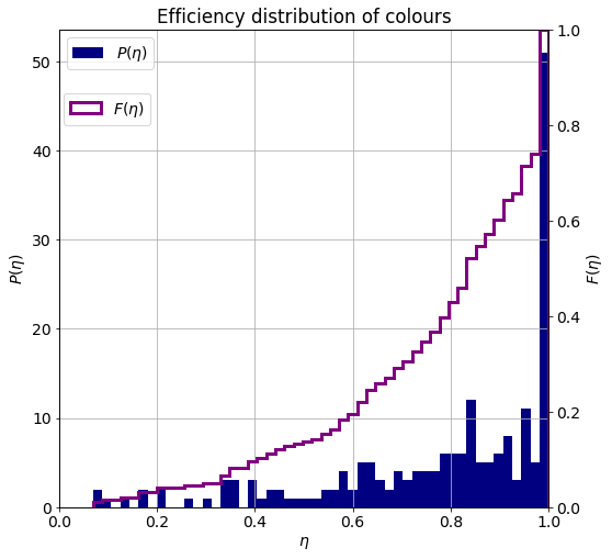
The probability density and cumulative distribution functions of the efficiency are shown below. The mode of the distribution is at unit, so that the most frequent type of flag equally distributes its area among its colours. There is an interesting second maxima around 0.8 and a stanalone cluster at 0.2. These are coming from flags of roughly uniformly and disproportionately divided areas.
Joint number and diversity distributions
We already know which are the most frequent numbers and distribution patterns of colours. It is rather intriguiging to investigate how these two quantifiers are related to each other. A joint histogram $P(n, \eta)$ can reveal clusters of flags, whereas the conditional distribution function $P(\eta | n)$ uncovers regularities as a function of the number of colours.
hist_n_eta_joint = np.histogram2d(
    df_flag["n-colour"],
    df_flag["efficiency"],
    bins=(9, 30),
    range=[[2, 11], [0, 1]]
)[0].T

hist_n_marg = hist_n_eta_joint.sum(axis=0)
mask = hist_n_marg != 0
hist_n_eta_cond = np.zeros_like(hist_n_eta_joint)
hist_n_eta_cond[:, mask] = hist_n_eta_joint[:, mask] / hist_n_marg[mask][None, :]
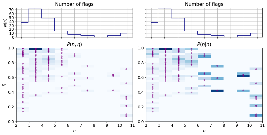
The bottom left panel of the figure above $P(n, \eta)$ whilst the one next to it depicts $P(\eta | n)$. The individual data are overlaid as purple cirles. For the ease of discussion, the count of flags composed of a certain number of colours are plotted above the joint plots.
The following observations can be made:
- The most frequent flag type is of displaying three colours in equal or almost equal ratio.
- There is a pronounced cluster of $n={4, 5}$ flags of uneven colour shares.
- Flags with higher number of colours tend to distribute them inequally.
- The rare occurence of flags with number of colours greate than seven makes it difficult to make statistically relevant statements.
Colours
We now proceed to investigate the colours themselves.
Colour propensity
For all colours, the number of flags in which they appear is counted and a histogram is formed:
\[r_{j} = \frac{\sum\limits_{i=1}^{N_{f}} \mathbf{1}_{\mathcal{C}_{i}}(c_{j})}{N_{f}} \, .\]where $\mathbf{1}_{\mathcal{S}}$ is the indicator function. These ratios do not take into account the areas occupied by them. The counts are thus weighted by the colour weight to obtain a more descriptive measure:
\[r_{w,j} = \frac{\sum\limits_{i=1}^{N_{f}} \mathbf{1}_{\mathcal{C}_{i}}(c_{j}) \cdot w_{i,j}}{N_{f}} \, .\]Please note, the colour weights sum up to the number of flags:
\[\sum\limits_{i=1}^{N_{f}}\sum\limits_{j=1}^{N_{c, j}} = N_{f} \, .\]# non-weighted
colours, counts = np.unique(
np.array(list(chain(*df_flag["colours"].values))),
return_counts=True
)
idcs = np.argsort(counts)[::-1]
colours, counts = colours[idcs], counts[idcs]
counts = counts / len(df_flag)
# weighted
df_ = pd.DataFrame.from_records({
"cls": list(chain(*df_flag["colours"].values)),
"whs": list(chain(*df_flag["fractions"].values))
})
df_ = df_.groupby(["cls"])["whs"].sum().sort_values(ascending=False)
colours_w, counts_w = df_.index.values, df_.values
counts_w = counts_w / counts_w.sum()
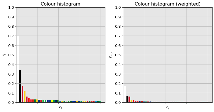
White appears on about seventy percent of the flags. One third of them contain black, and one fifth contain pure red. Yellow is relatively popular with its propensity of fifteen percent. None of the other specific colours can be seen in more than five percent of the flags.
In terms of total area occipied (right panel), white comes first with a share of about eighteen percent. It means that this colour covers the quarter ($18/70 \approx 0.25$) of the flag whenever it is featured. It is worthwhile noting that the while colour black is in approximately twice as many as many flags than red, their area ratios are roughly equal. The reason lies in black is being used only to accentuate smaller details in many cases. The rest of the indvidual colours have marginal coverage.
Colour clustering
One readily notice the similarity between the colours in the plots above. They are however treated as separate ones. It is possible distinguish certain groups of colour e.g dark red, light green, dark green which are akin to the extent that they could be considered identical. This observation brings about the idea of clustering the colours.
Choosing colour space
The colours are converted to the L*a*b* colour space in which the distances better approximate human colour perception.
coords = np.array([decode_colour_code(x) for x in colours_w])
coords_lab = rgb2lab(coords.reshape(-1, 1, 3)/255).reshape(-1, 3)
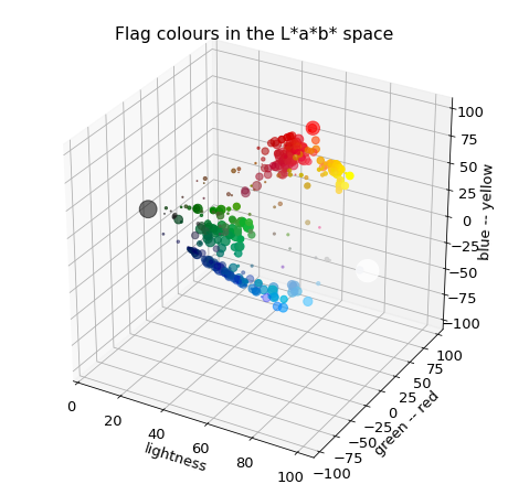
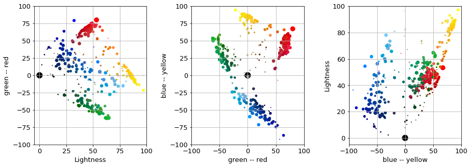
The plots below show the propensity of colours in thehe L*a*b* frame and their projections onto the planes spanned by the pairs of axes.
Colour groups
A handful of blobs can be identified by a cursorily look: red, pale and dark green, pale, medium and dark blue, yellow and orange. There is also a scattering of colours between the main groups which does not form a cluster. Some colours continuously blend into each other such as the pale green $\rightarrow$ dark green transition. This might imply the use of space partitioning methods such as k-means or k-medoids. The blobs are not of spherical shape which plays practically against the use of distribution based method.
Choosing a clustering method
We need a method that considers the local density of the colours and can cope with elongated continuous shapes. We also have to decide whether all points should belong to clusters. Along the following thoughts choose we the algorithm:
- Distribution based methods e.g. are likely to go belly up because of the low number of points, if they are fully paramtrised. If not, the blobs are not Gaussian looking so they might be of limited use.
- Meanshift is out of question because of the bandwidth parameter would vary across regions.
- k-means is just too crude, the space does not have a Voronoi-like structure.
- k-medoids also partitions the space which might come useful when separating the transitioning colours. It also has the favouranle property of selecting an existing colour as the cluster centre.
- Affinity propagation, just like the k-medoids chooses am existing colour as a centre. However, it tends to be too greedy.
- Agglomerative clustering implicitly considers local density via gradually building up the clusters. However, uneven density can result in either too many or too large groups depending on the cutoff value.
- DBSCAN and OPTICS can consider varying densities.
Choice
We will invoke a two step clustering process.
- The first step of which separates dense regions of colours.
- The second one partitions, further refines the so found clusters.
It turns out, k-medoids with colour weights and DBSCAN yield aesthetically reasonable clusterings. The word “aesthetically” was used on purpose. We are seeking to group the colours that preceptually similar. The emphasis is less mathematical this time. Also, the L*a*b* colour space is not exact either.
K-medois
The reader is spared from the usual hyperparameter optimisation. It was of limited joy of mine, it would be certain that to the audience. The best k-medoids results are presented below.
#  k-medoids
clusterer_kmed = KMedoids(n_clusters=7, seed=10)
clusterer_kmed.fit(coords_lab[2:], weights=counts_w[2:])
labels_kmed, centres_kmed = process_clustering_results(clusterer_kmed, add_bw=True)
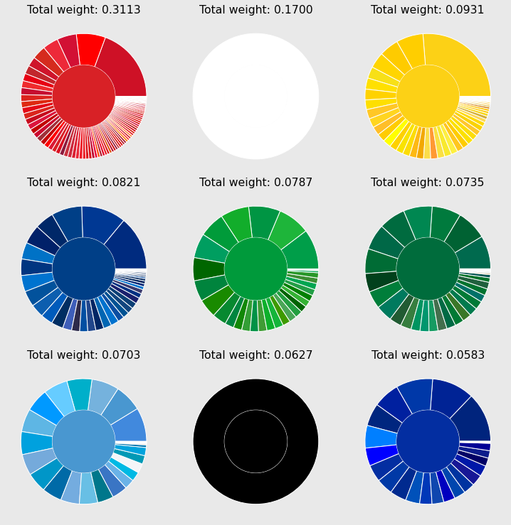
There are nine clusters in total
- red, white, black
- yellow
- two shades of green
- three shades of blue
The area which they cover across all flags are displayed as the total weight. The smallest cluster has a four percent share. Assuming that each flag is composed of the average four colours, this medium blue colour can be found in about twenty percent of the flags.
Some colour wheels contain unalike colours, such as the dark green slice at four o’clock in the middle wheel. There are two possible causes of this phenomenon. Either the distances in the used colour space do not reflect the human perception sufficiently. Alternatively, the paritioning algorithm is too crude. There many regions pushing each other back and forth during the iterative paritioning which can influence the global assignment of cluster labels.
Refinement
To refine the assignment, the clusters of similar hue
- are grouped together
- and reclustered using a larger number of centres
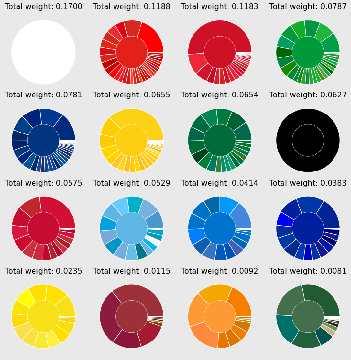
The sixteen clusters are shown below. The colours are now more homogenously grouped to gether. It is especially worth noting the appearance of four shades of red. The lowest fraction is just below one percent, thus all of the main colours have a singificant contribution.
Cluster analysis
It is interesting to measure how much the original and the centre colours whose cluster they belog to deviate across all flags. In other words, the differences between the orignal canvases and the ones in which the colours have been replaced by the centre of the cluster to which they belong. Firstly, all L*\a*b* components in each flag mapped to their cluster centres.
# cluster centres in L*a*b*
centres_lab = {
    k: rgb2lab(v.reshape(1, 1, 3)).reshape(3) for k, v in centres.items()
}

# create colour index -- cluster label mapping
colour_label_mapper = dict(zip(colours_w, labels))

# assign cluster label to each colour in all flags
df_flag["colours-label"] = df_flag["colours"].apply(
    lambda x: [colour_label_mapper[y] for y in x]
)

# look up L*a*b* colours of the label
df_flag["colours-lab-main"] = df_flag["colours-label"].apply(
    lambda x: [centres_lab[y] for y in x]
)
If the cluster centre of the j-th colour in the i-the flag is $c^{*}_{ij}$, then the distance between the original and clustered pairs can be given as:
\[d_{i}^{c} = \sum\limits_{j=1}^{n_{c,i}} ||c_{ij} - c^{*}_{ij}||_{2} \cdot w_{ij} \, .\]df_flag["orig-main-dist"] =\
df_flag[["colours-lab", "colours-lab-main", "fractions"]].apply(
lambda x: calc_flag_distance(*x), axis=1
)
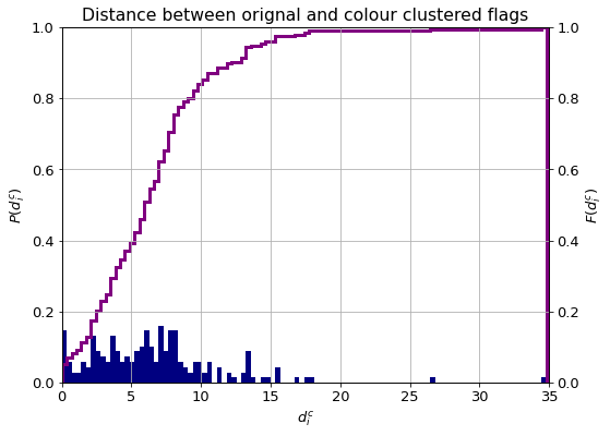
The histogram and cumulative distribution function of the distances are plotted below. An average human observer can distinguish between two colours if their distance is greater than unit. This threshold is exceeded by about ninety percent of the flags. Values above five indicate colours that are considered different by humans, in which category about the sixty percent of the flags fall.
Co-occurence of colours
We now have a look at what colours tend to appear together. There are two ways of looking at this problem. One can either enumerate all flags composed of the same number of colours and count how many flags of the same group (e.g bicolor, tricolor) contain the same colours. Alternatively, one can look for the same colour tuples appearing across all of the flags. These concepts are colourfully illustrated below.
edges = defaultdict(int)  #  any cooccurrence
pairs = defaultdict(int)  #  pairs only in 2-colour flags
triplets = defaultdict(int)  #  only triplets only in 3-colour flags
triplet_pairs = defaultdict(int)  #  pairs only in 3-colour flags

for clbs in df_flag["colours-label"]:

    clbs_ = tuple(sorted(clbs))

    if len(clbs_) == 2:
        pairs[clbs_] += 1

    elif len(clbs_) == 3:
        triplets[clbs_] += 1
        triplet_pairs[clbs_[:2]] += 1
        triplet_pairs[clbs_[1:]] += 1
        triplet_pairs[(clbs_[0], clbs_[2])] += 1

    for i, l1 in enumerate(clbs_):
        for l2 in clbs_[i:]:
            edges[(l1, l2)] += 1
pairs = sorted(pairs.items(), key=lambda x: x[1])[::-1]
triplets = sorted(triplets.items(), key=lambda x: x[1])[::-1]
triplet_pairs = sorted(triplet_pairs.items(), key=lambda x: x[1])[::-1]
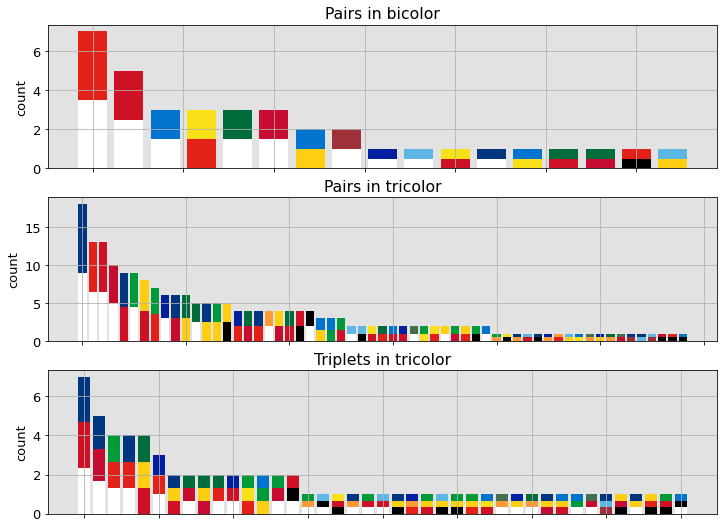
The topmost panel is a statistics over bicolor flags. It shows that the red–white combination is by far the most popular. The middle panel characterises tricolor flags by counting the number of time a cerain pair of colours appear in them. The dominance of the red–white pair is unquestionable. Yellow–other colour couples also have a considerable share. The panel in the bottom is a histogram of tricolor flag compositions. Red–blue–white is being the most frequent.
Create graph
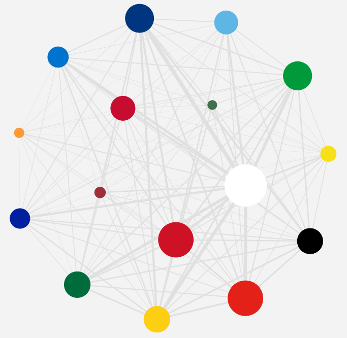
It is also possible to count all pairs across all flags. By doing so, a graph is created where each node is a colour and each edge represents a cooccurance. The weight of the edge is proportional to the number of flags in which the two connected colours appear together.
Flag similarity
If anything, the observation from the digression transpires that some flags are more similar to each other than others. The similarity is quantified in this section.
Overlap in the L*a*b* space
A straightforward way to measure similarity, or distance, is to calculate pointwise the $L_{2}$ distance between the flags. Up until now all of the canvases had equal area. They, in reality, have differenct shapes and sizes which makes it impossible to compare any arbitrary pairs pixel-by-pixel. Rescaling the images to the same size and shape might be a solution, altough a costly one. It is rather easier to define a grid over the canvas in terms of relative height and width coordinates.
If the flag $F_{i}$ has the shape of $n_{h, i}, n_{w, i}$ and it is sampled at $N_{h}$ and $N_{w}$ equidistant vertical and horizontal raster points, the pixel coordinates of them are given by: \(\begin{eqnarray} \delta_{h,i} &=& \frac{n_{h,i}}{n_h - 1} \\ \delta_{w,i} &=& \frac{n_{w,i}}{n_w - 1} \\ r_{h, i, k} &=& \left \lfloor \frac{k\cdot \delta_{h,i}}{n_{h,i}} \right \rceil \\ r_{w, i, k} &=& \left \lfloor \frac{k\cdot \delta_{w,i}}{n_{w,i}} \right \rceil \end{eqnarray}\)
The distance, $d_{ij}^{lab}$ between two flags, $F_{i}, F_{j}$ then becomes:
\[d_{ij}^{lab} = \sum\limits_{k=0}^{n_h}\sum\limits_{l=0}^{n_w} \frac{|| F_{i}(r_{h, i, k}, r_{w, i, l}), F_{j}(r_{h, j, k}, r_{w, j, l})||_{2} } {n_{h} \cdot n_{w}} \, .\]The canvases are loaded to the working memory:
countries, canvases = zip(*(
    (x.split("/")[-1].split(".")[0], imageio.imread(x))
    for x in path_to_images
))
The RGB images are converted to the L*a*b* space as usual.
canvases = [rgb2lab(x / 255) for x in canvases]
The number of raster points in each dimension are taken to be the median sizes.
n_h, n_w = np.median([x.shape[:2] for x in canvases], axis=0).astype(int)
def generate_raster_points(image, n_h, n_w):

    height, width = image.shape[:2]
    raster_h = np.rint(np.linspace(0, height-1, num=n_h)).astype(np.int)
    raster_w = np.rint(np.linspace(0, width-1, num=n_w)).astype(np.int)

    return raster_h, raster_w
All samples are generated in one pass. This is memory consuming, but results in considerable speedup.
samples = []
for canvas in canvases:
    rh, rw = generate_raster_points(canvas, n_h, n_w)
    samples.append(canvas[rh[:, None], rw])
The pairwise distances are then calculated:
distances_lab = []
for i, sample_1 in enumerate(samples):

    for j_, sample_2 in enumerate(samples[i+1:]):
        j = j_ + i + 1

        distance = sample_1 - sample_2
        distance = np.sqrt((distance * distance).sum(axis=-1)).sum()
        distances_lab.append([i,j, distance / (n_h * n_w) ])

distances_lab = np.array(distances_lab)
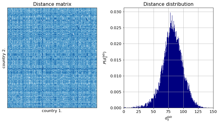
The distance matrix has no structure as one expected, for the flags are ordered randomly. The distance distribution is unimodal. It means there are no major wildly different groups of flags. Should it be the case, at least three model could be observed. However, it is clear from the inspection of the shape of the distribution that it is composed of a sum of distributions. Therefore there are distict groups of flags.
They are easily identified by any clustering algorithm. For we are interested in pairwise similarites, agglomerative clustering is applied.
# perform Ward agglomerative clustering
links_lab = linkage(distances_lab[:, 2], method="ward")

# get cluster labels
clusters_lab = fcluster(links_lab, 260, criterion="distance")

# for plotting
mat_lab = squareform(distances_lab[:, 2])
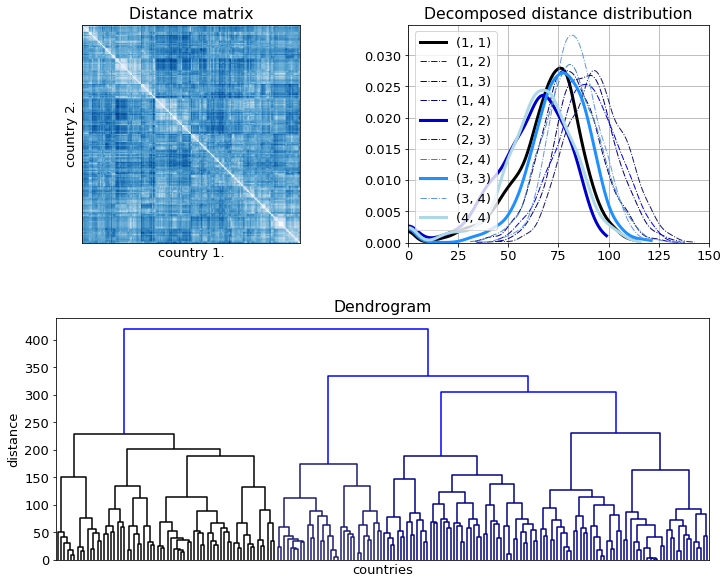
Having clustered the data, four main groups can be observed. However, the intra and inter cluster distances are not that much different as the reordered distance matrix and the decomposed distribution function show.
images_small = np.array([lab2rgb(x[::10, ::10]) for x in canvases])
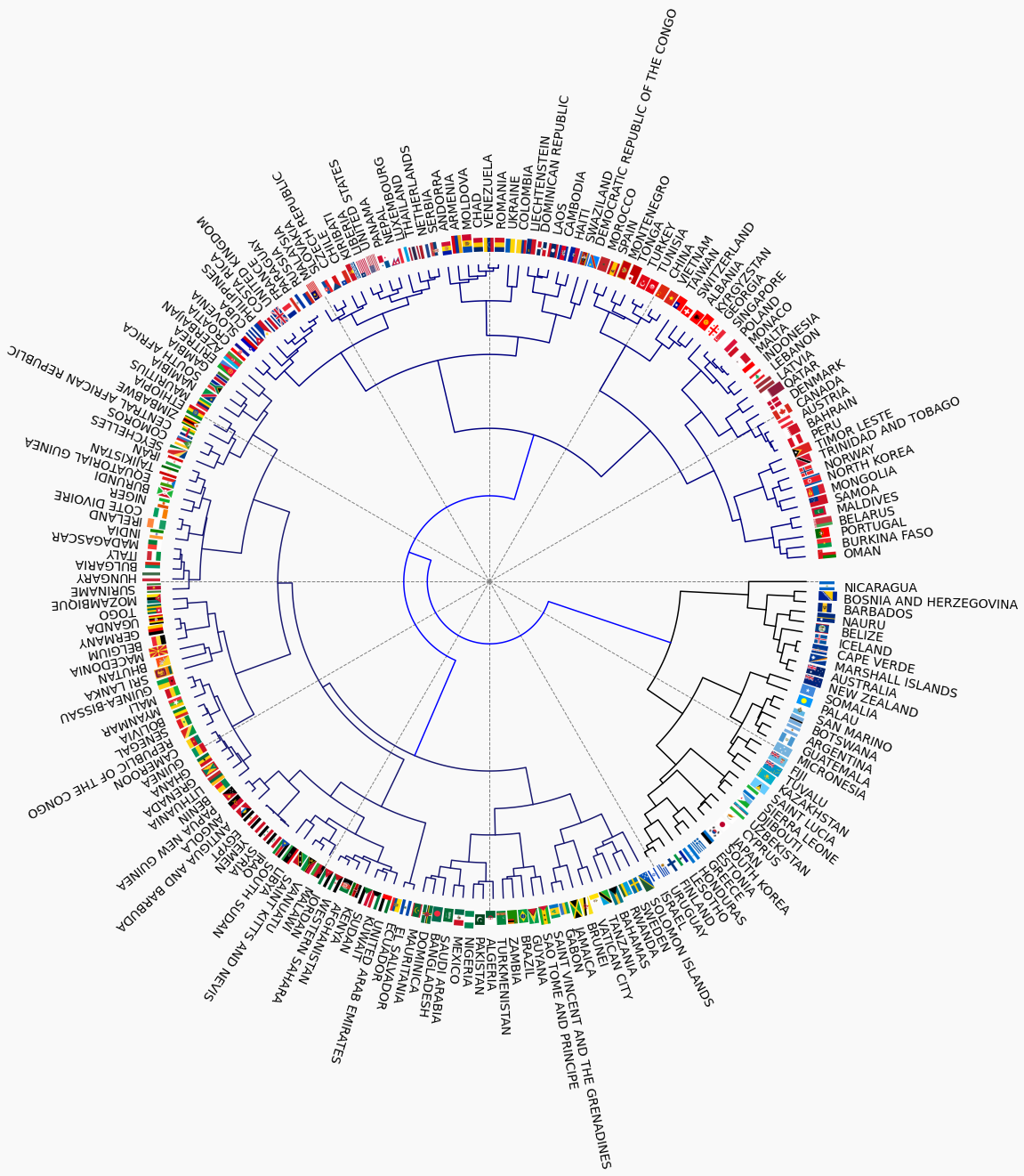
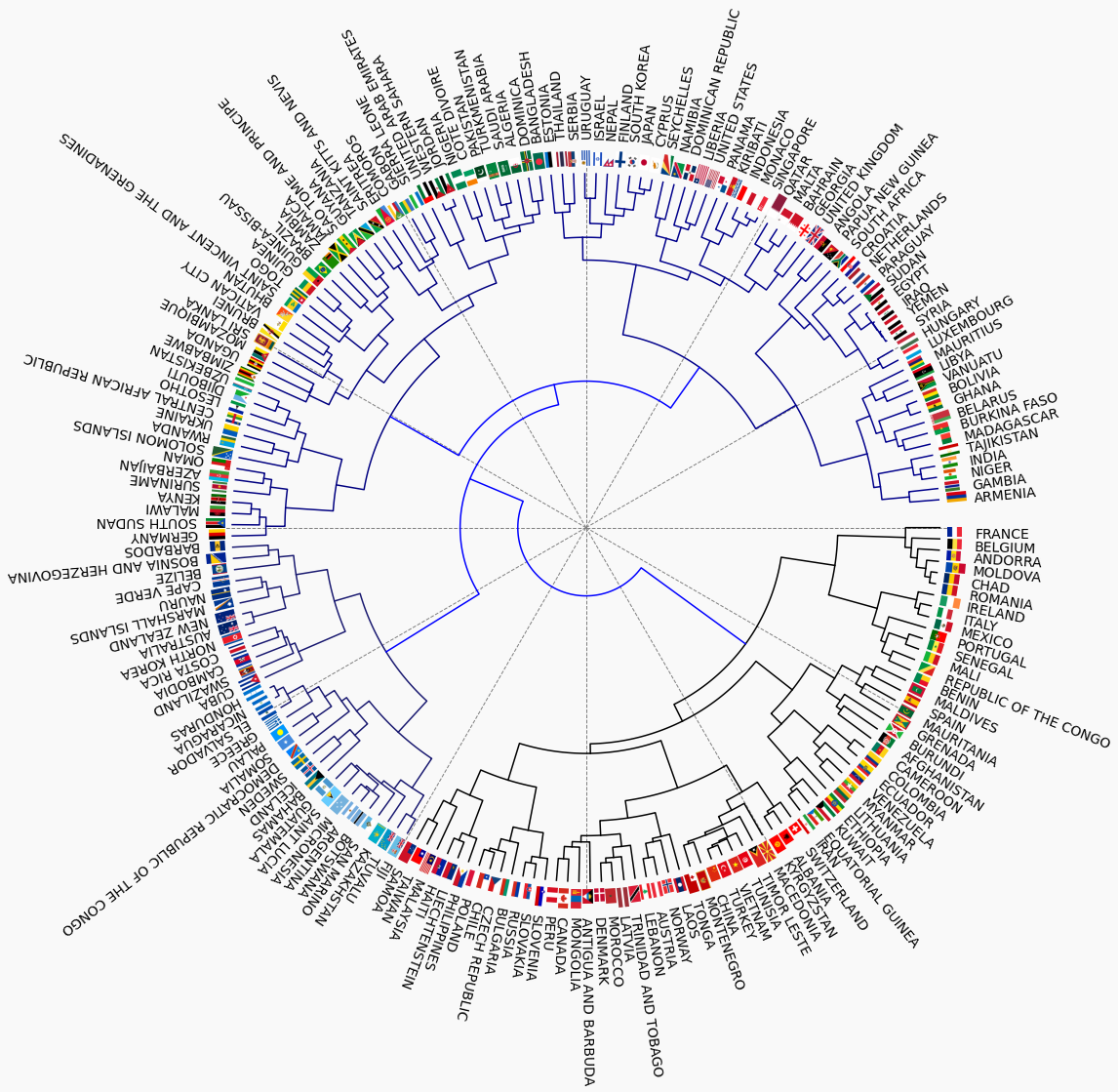
If the flags are associated with the nodes in the dendrogram a few interesting observations can be made. The positions of the the flags will be given in time coordinates. For example that of Germany is at 09:00.
- Nations of similar cultural heritage tend to appear together
- Arabic countries at 01:30 and 11:00
- Communist or former communist states at 05:30
- North Latin America at 04:00
- Meso American and Carribean countries at 10:00
- West African countries at 03:30
Similarity by component colours
The direct distance over the canvas has one major drawback: it is agnostic of the permutation of colours. For instance, x and y are made up from the same colours but in reversed order. As a consequence, their direct distance will be large, but perceptually they are similar.
Two flags are similar too, if they are composed of akin colours in close ratios. If we were compare their colour histograms they would be placed close to each other. However, all spatial information is then lost.
The earth mover’s difference is just the appropriate measure to carry out this comparison. Given two flags $F_{i}, F_{j}$, their colours are $\mathcal{C}_{i}, \mathcal{C}_{j}$, and the histograms $\mathbf{w}_{i}, \mathbf{w}_{j}$. The base distance between two colours is the ordinary $L_{2}$ one, which form a distance matrix, $D^{w}_{i}$ for each pairs of flags:
\[d^{w}_{ij, kl} = ||c_{i,k}, c_{j,l}||_{2} \, .\]The earth mover’s distance is the minimum amount of work required to transform one histogram to the other:
\[d^{e}_{i,j} = \frac{\sum\limits_{k=1}^{n_{i}} \sum\limits_{l=1}^{n_{j}} f_{ij,kl}d^{w}_{ij, kl}} {\sum\limits_{k=1}^{n_{i}} \sum\limits_{l=1}^{n_{j}} f_{ij,kl}}\]subjected to a set of constraints that ensure conservation of the flag area.
The EM distances have been calculated and then clustered in the same way the direct distances were. The distance matrix looks much cleaner and better structure. This is mainly due to clusters 1. and 4. being separated from the others as the right panel in the top row shows.
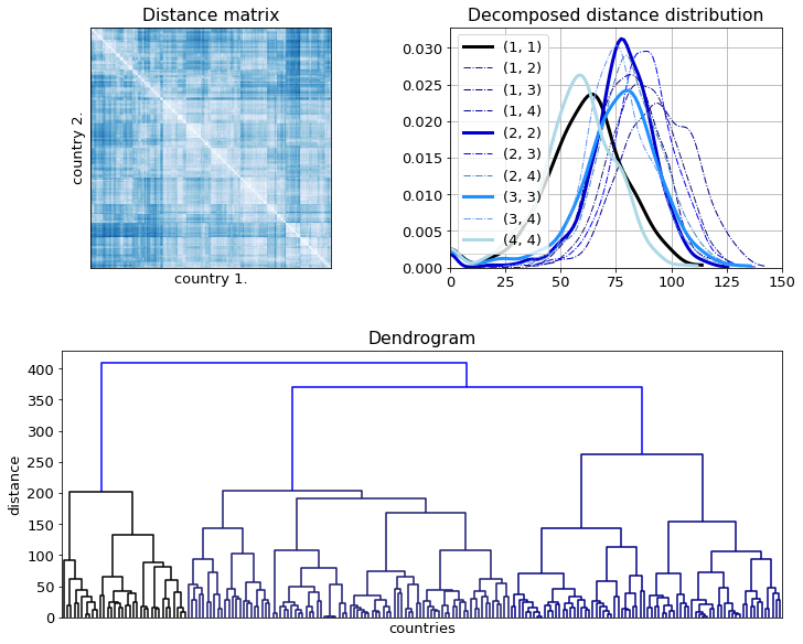
The dendrogram look remarkably different. A colour wheel has been generated along which the colours blend in to each other at least within the major clusters. The spatial arrangement of the components is ignored altogether, which becomes apparent by looking at the Indian–Irish pair just below 09:00.
The following group changes can be observed:
- The Sub-Saharan North African countries are now in one cluster at 08:00
- The two Islmaic groups are merged in to one at 07:00
